Set up a section
Definition
The definition of a section contains all the information regarding how your users will edit the content of your section. Section definitions can be written in YAML or JSON.
Example:
name: Hello world
icon: image_text
settings:
  - id: title
    label: Title
    type: string
  - id: background_image
    label: Background
    type: image_picker
blocks: []
{
  "name": "Hello world",
  "icon": "image_text",
  "settings": [
    {
      "id": "title",
      "label": "Title",
      "type": "string"
    },
    {
      "id": "background_image",
      "label": "Background",
      "type": "image_picker"
    }
  ],
  "blocks": []
}
Section
Section Attributes
(Mandatory attributes in bold).
| Attribute | Description |
|---|---|
| name | Name of the section displayed in the back-office. |
| icon | Icon displayed in the back-office. Available values:\ • list\ • text\ • image_text\ • slide\ • header\ • footer |
| class | Sections are wrapped inside a DIV tag. The value provided for class will be added in the list of CSS classes of the DIV. |
| keep_icon | Boolean to force the display of the icon in the editor instead of the first image setting. Default value: false |
| keep_name | Boolean to force the display of the section name instead of the first text setting. Default value: false |
| blocks_label | Label to display above the blocks list in the editor. |
| blocks_display | Determines how blocks are displayed in editor and rendered on the front end. Available values:\ • list (default)\ • tree (allows blocks to be nested) |
| block_max_depth | Determines the depth of block nesting allowed. Default value: 0 |
| settings | Array. See the Settings chapter below. |
| blocks | Array. See the Blocks chapter below. |
| presets | Only used if the section is aimed to be included in the sections_dropzone liquid tag. |
| default | Only used if the section is included thanks to the section liquid tag. |
Blocks
The definition of a block contains all the information regarding how your users will edit the content of your block. Section definitions can be written in YAML or JSON.
Example
blocks:
  - name: Menu item
    type: menu_item
    settings:
      - label: Title
        id: title
        type: text
        default: Item
      - label: Url
        id: url
        type: url
        default: "#"
{
  "blocks": [
    {
      "name": "Menu item",
      "type": "menu_item",
      "settings": [
        {
          "label": "Title",
          "id": "title",
          "type": "text",
          "default": "Item"
        },
        {
          "label": "Url",
          "id": "url",
          "type": "url",
          "default": "#"
        }
      ]
    }
  ]
}
Blocks Attributes
The blocks attribute of a section is an array of objects. Each object represents a different type of block.
Using the editor, users are able to fully manage (add, update, re-order, nest, and delete) the list of blocks within a section.
| Attribute | Description |
|---|---|
| name | Name of the block. Not used in the editor. |
| type | Type of the block. It is up to the developer to pick a meaning name. For instance, if blocks are aimed to display a slider, image_slide would be a good name for a block representing an image. |
| settings | Array. See the Settings chapter below. |
Settings
The settings attribute of a section or block is an array of objects with the following attributes. (Mandatory attributes in bold).
Settings Attributes
| Attribute | Description |
|---|---|
| label | Label displayed in the editor. |
| id | Unique identifier of the setting. The id will be also used in the liquid template of the section to access this setting. Note: Where type: content_type is being used, the id must match the slug of the desired content_type. |
| type | Type of the setting. Available values:\ • text\ • image_picker\ • asset_picker\ • url\ • checkbox\ • radio\ • select\ • content_type\ • content_entry\ • hint See the Settings Types chapter below for an explanation of each type. |
| default | Default value when the section is global or standalone. |
| only_if | Accepts the id of a checkbox setting within the same section or block. Displays the setting only if the provided checkbox is set to true. e.g. only_if: visible ("visible" being the id of a checkbox setting within the same setting or block). |
| content_type | Used only in conjunction with type: content_entry to specify the content_type used to populate the content_entry list. |
Settings Types
| Type | Description | Options |
|---|---|---|
| text | Display a text input (simple text field or a rich text editor). | • html: true: enables a rich text editor\ • line_break: true: causes the carriage return (Enter key) to generate a `tag instead of a closing tag of the current html element\ •nb_rows: `: defines the number of rows for the text area |
| image_picker | Add an image picker to the editor. | Defining the following options will add a cropping tool with the defined pixel dimensions: • width: compress option. Compression is done in the browser before uploading the image to the server. Example: compress: { max_width: |
| asset_picker | Add an asset picker to the editor. | |
| url | Add an url picker to the editor. | |
| checkbox | Display a checkbox in the editor. | • true\ • false |
| radio | Display a radio button in the editor | Define radio options with the following syntax:\ `options: * label: My Label\ value: my_value` |
| select | Add a select box to the editor. | Define select options with the following syntax:\ `options: * label: My Label\ value: my_value` |
| content_type | Add a shortcut to the list of the entries of the content type specified by the id attribute of the setting. |
|
| content_entry | Add a text search field from which a content_entry may be | |
| hint | Use the label of the setting to display a help message to the users |
Examples:
---
name: Kitchen Sink
settings:
  - label: Title
    id: title
    type: text
---
<h1>{{ section.settings.title }}</h1>
---
name: Kitchen Sink
settings:
  - label: Title
    id: title
    type: text
    html: true
    line_break: true
---
<h1>{{ section.settings.title }}</h1>
---
name: Kitchen Sink
settings:
  - label: Body
    id: body
    type: text
    html: true
---
<h1>Some text typed in a rich text editor</h1>
<div>{{ section.settings.body }}</div>
---
name: Kitchen Sink
settings:
- label: Image
  id: image
  type: image_picker
  compress:
    quality: 0.7
---
<h1>A cat?</h1>
<img src="{{ section.settings.image }}" />
<img src="{{ section.settings.image | resize: '60x60#' }}" />
---
name: Kitchen Sink
settings:
- label: Background image
  id: image
  type: image_picker
  height: '1920'
  width: '1240'
---
<div class="hero-with-banner" style="background-url: url({{ section.settings.image }})">
  <h1>My Hero</h1>
</div>
---
name: Kitchen Sink
settings:
  - label: Call to action
    id: cta_link
    type: url
---
<a href="{{ section.settings.cta_link }} {{ section.settings.cta_link.new_window_attribute }}">Get started!</a>
---
name: Kitchen Sink
settings:
- label: Display title?
  id: has_title
  type: checkbox
---
{% if section.settings.has_title %}
<h1>My awesome site</h1>
{% endif %}
---
name: Kitchen Sink
settings:
  - label: Season
    id: season
    type: radio
    options:
      - label: Winter
        value: winter
      - label: Spring
        value: spring
      - label: Summer
        value: summer
      - label: Autumn
        value: autumn
---
<p>
{% case section.settings.season %}
{% when 'winter' %}
<img src="/samples/winter.png" />
{% when 'spring' %}
<img src="/samples/spring.png" />
{% when 'summer' %}
<img src="/samples/summer.png" />
{% when 'autumn' %}
<img src="/samples/autumn.png" />
{% endcase %}
</p>
---
name: Kitchen Sink
settings:
- label: Movie category
  id: movie_category
  type: select
  options:
  - label: Drama
    value: Drama
  - label: Fantastic
    value: Fantastic
  - label: Comedy
    value: Comedy
---
<p>Movie category: {{ section.settings.category }}</p>
---
name: Kitchen Sink
settings:
  - label: List of projects
    id: projects
    type: content_type
---
---
name: Kitchen Sink
settings:
  - label: List of projects
    id: projects
    type: content_entry
    content_type: projects
---
---
name: Kitchen Sink
settings:
  - label: Here is a help message displayed in the editor
    id: some_help
    type: hint
---
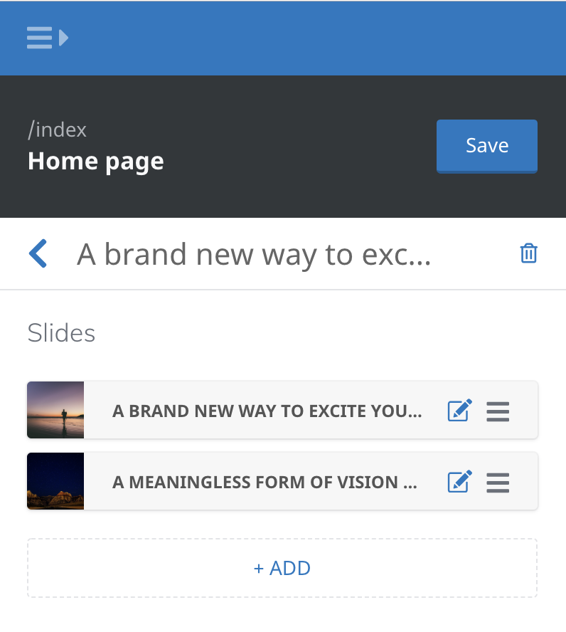
Screenshot
Dropzone presets
LocomotiveCMS needs the presets to build the library of sections available for the sections_dropzone liquid tag.
You can also use the presets to define different versions of the section. The versions only differ by the content they offer.
In order to enable a section for the dropzone, the dropzone_presets (or presets) attribute is absolutely required.
Without this, you won't see your section among the list of available sections.
Attributes
The mandatory attributes are in bold.
| Attribute | Description |
|---|---|
| name | Name displayed in the gallery of sections |
| category | A simple string. Sections have to be grouped inside categories. |
| settings | Basically an object whose keys are the setting ids and values are the content. |
| blocks | An array of objects. An object has 2 properties: type (based on the block types defined in the sections) and settings (identical as the settings attribute right above). |
Example
dropzone_presets:
  - name: Mixed slider
    category: Marketing
    settings:
      title: My slider!
    blocks:
      - type: image_slide
        settings:
          title: "Slide #1"
          description: Lorem ipsummm
          image: "/samples/bg.png"
      - type: video_slide
        settings:
          title: "Slide #2"
          video: "//youtube/cat.mov"
{
  "dropzone_presets": [
    {
      "name": "Mixed slider",
      "category": "Marketing",
      "settings": {
        "title": "My slider!"
      },
      "blocks": [
        {
          "type": "image_slide",
          "settings": {
            "title": "Slide #1",
            "description": "Lorem ipsummm",
            "image": "/samples/bg.png"
          }
        },
        {
          "type": "video_slide",
          "settings": {
            "title": "Slide #2",
            "video": "//youtube/cat.mov"
          }
        }
      ]
    }
  ]
}
Additional Notes
- Only sections which contain a
dropzone_presetsattribute will be available within the sections_dropzone dropzone_presetsis an alias forpresets
Default
If your section is standalone or global, it is recommended to add a default attribute to the section definition. Default is an object that can override settings' default and define some blocks to start with like the presets described above.
Example
default:
  settings:
    title: Hero title goes here
    description: A description of the hero
  blocks: []
{
  "default": {
    "settings": {
      "title": "Hero title goes here",
      "description": "A description of the hero"
    },
    "blocks": []
  }
}